|
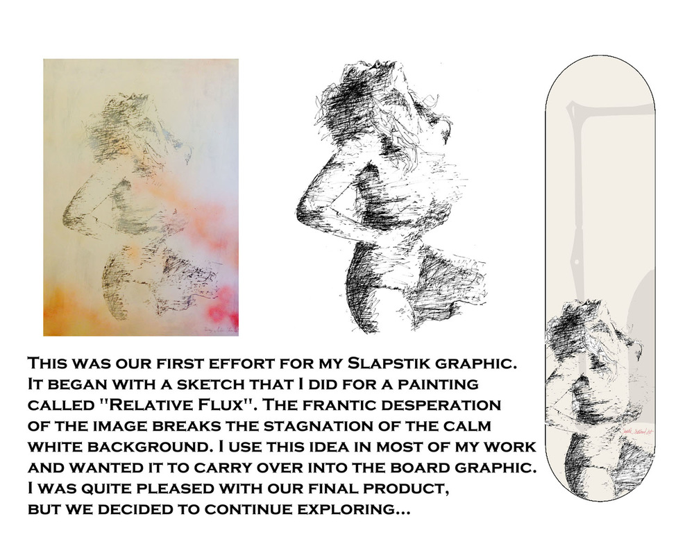
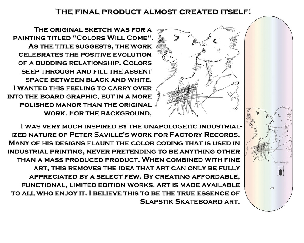
Figuring out which image to apply to a skateboard can be stressful. Spending hundreds, if not thousands of dollars on mass producing a thing you like, with the hopes that at least 100 others will buy (because your "like" is only worth 1/100 of a buyer's monetary value). I've tried not to let this get in the way choosing which artists and images to work with for Slapstik which has sometimes cost me a lot of money for a small learning experience. However, I've learned that my missteps have taught me how to accurately judge the market value of other designer's work on a skateboard. All of this brings me to Andrew Thomas. When given the opportunity to design a deck graph for Slapstik Andrew was a bit intimidated by the size of the logo he had to work around. No matter how much freedom I expressed to Andrew that he had over the direction and use of the logo it just couldn't get going until a series of text images back and forth over the span of a week. Below is that process from Andrew's perspective on how the final graphic came to be. It was a pleasure working with Andrew and seeing the ideas and planning come to life. For more of Andrew's work visit his site at www.henryandrewthomas.com.
sb
0 Comments
Leave a Reply. |


 RSS Feed